Mosip
Branding and UI
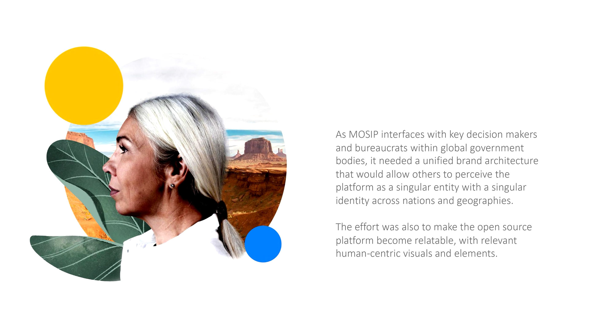
How did we enable an open source identity platform, elevate its presence on global platforms and at worldwide events through a unified brand architecture?
THE SOLUTION
Design
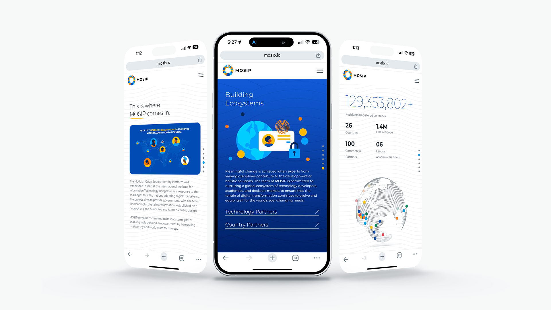
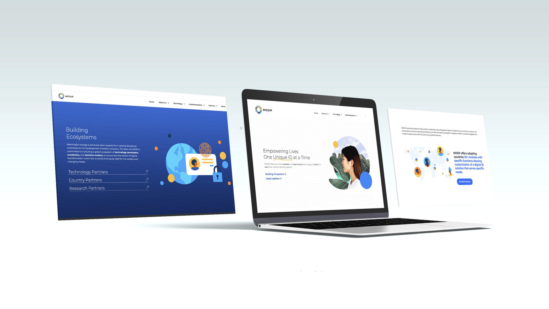
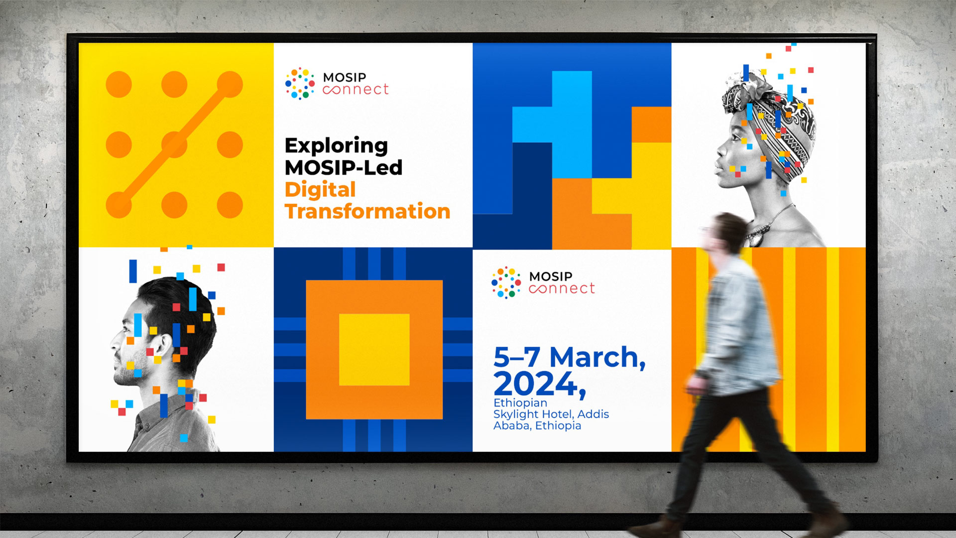
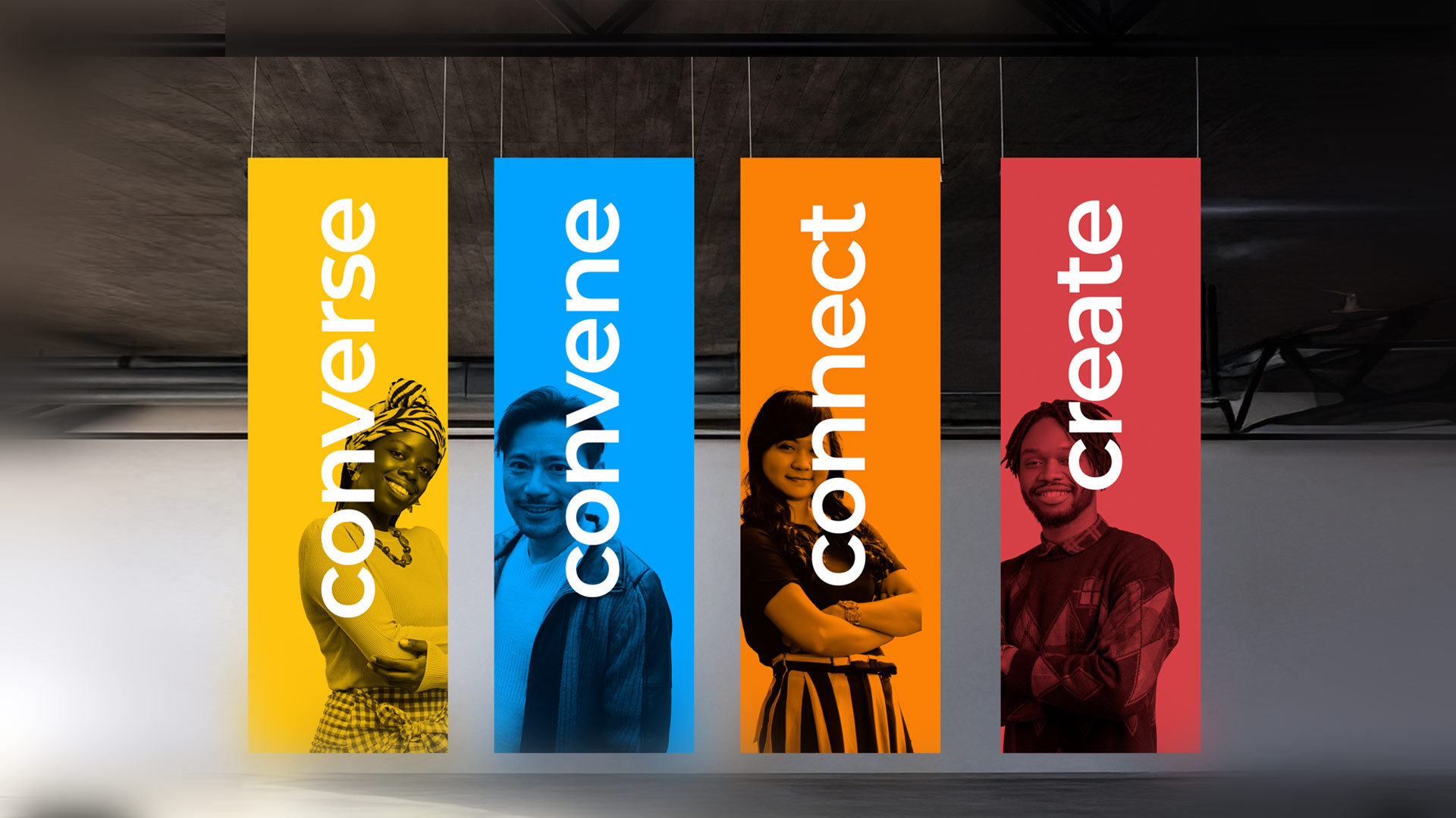
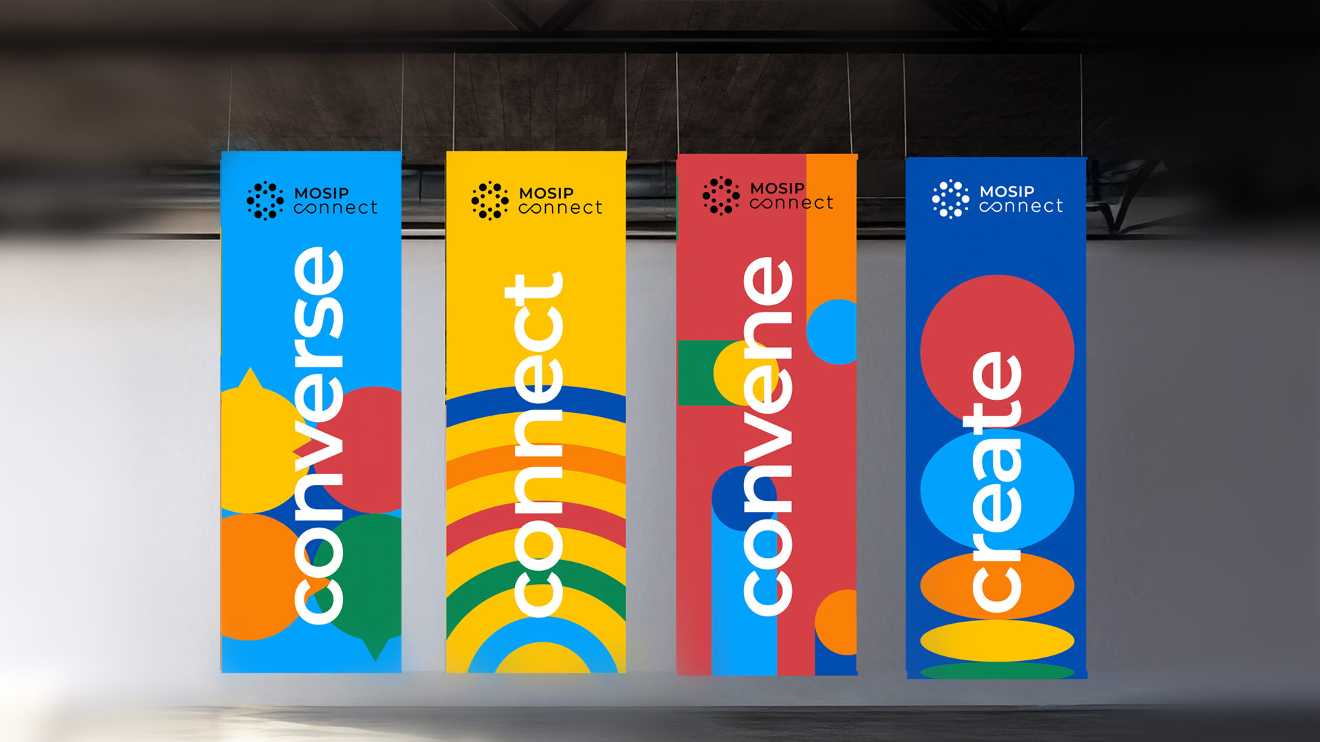
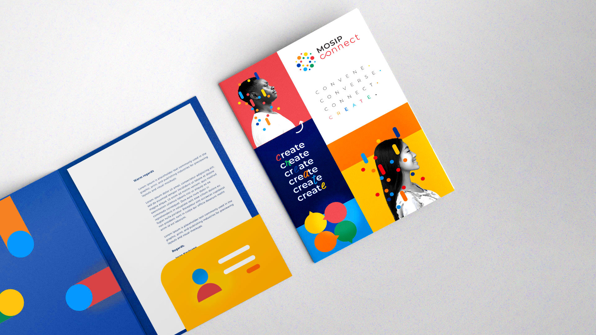
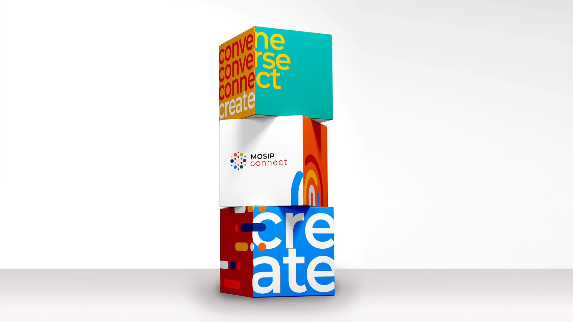
The first step was the visual branding process. We strategically crafted a brand language and visual system that could be extended seamlessly across MOSIP’s sub-brands.
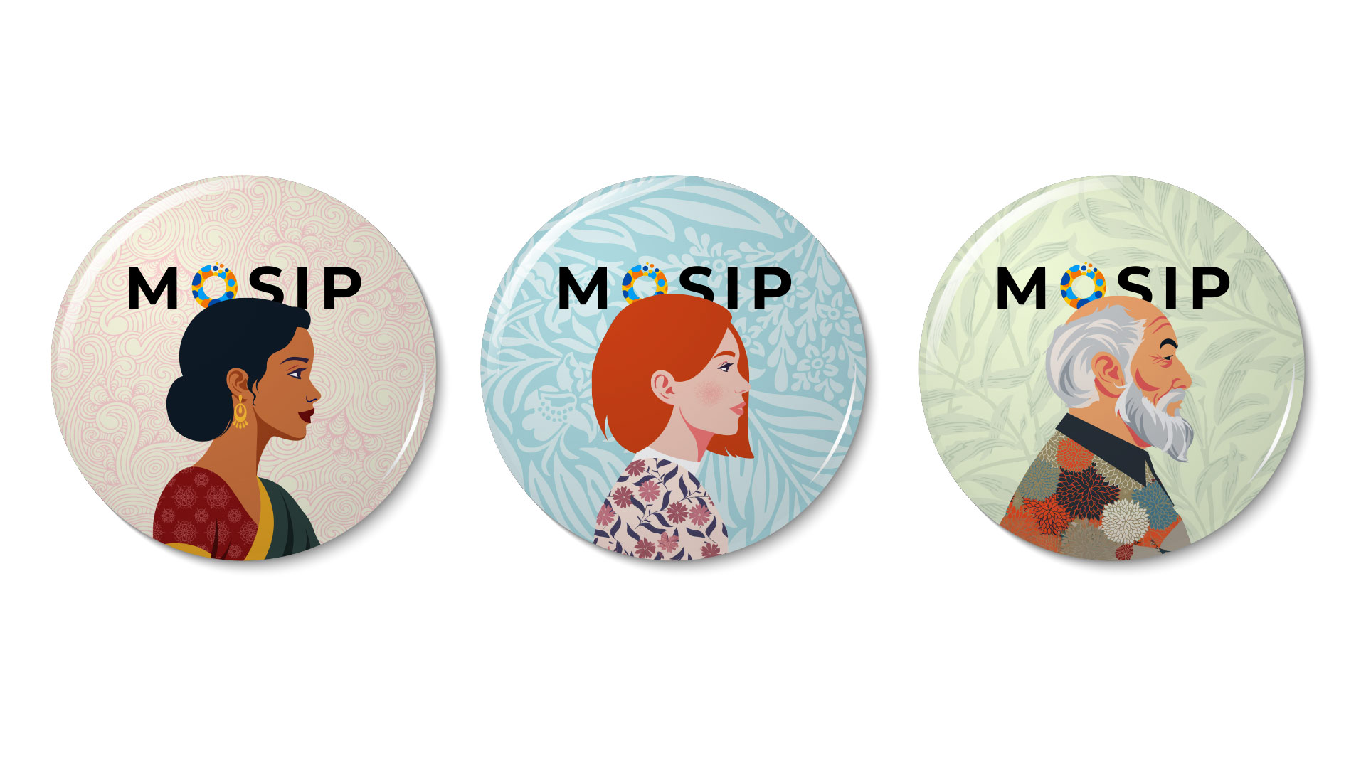
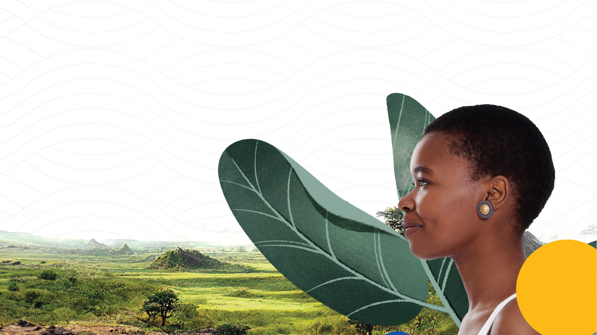
The visual identity was developed with an illustration style, brand colors, photography and font that could visually communicate the company’s purpose - empowerment. We steered clear of visual elements that indicated that the community they serve is in need.
A visual system (consisting of all branding elements) to represent a community of people who are integral to a country’s heritage and culture, and benefit from the additional resources the country has to offer.