Aditi Consuting
based off Bellevue, Washington, United States, helps Fortune 500 companies attain their transformation goals by providing customized solutions that bring together the right talent and technology.
Brief
To rebrand Aditi and develop a unified identity.
Solution
We created a brand framework around a look and feel that not only differentiated Aditi Consulting from its competitors but also aligned numerous internal departments with a simplified brand architecture (shown below).
Brand Framework

Brand Form
We harnessed the square and rectangle as the key components in all creatives. When combined in different sizes and forms, they give the brand a unique and unified look and feel.
Logo Type
The key objective was to refresh the main logo, while also capturing the key elements of the previous logo to ensure brand recognition and familiarity. So, we refined and simplified the earlier logo for better readability and fit on all platforms. However, alongside, we retained the Aditi type, to retain brand recognition and recall.
Color
The brand color palette was changed significantly to colors that communicated a welcoming feel along with the seriousness of Aditi Consulting being a corporate organization.

Photography
In its visual communication, Aditi Consulting aims to depict modern strivers in the workplace. We featured individual hero stills to honor their distinct achievements and showcase their entrepreneurial spirit, while also capturing authentic business productivity for a variety of industries.

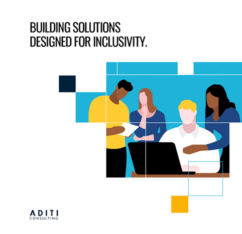
Illustrations
The goal was to create a unique character set that clearly represents the Aditi culture a diverse workforce that is committed to delivering quality work. However, alongside, we were to ensure that the characters did not come across as being too casual or cartoony.
We achieved this by keeping the illustration style simple. We used a mix of rounded and sharp forms so that the characters do not come across as either too rigid or casual. Additionally, we really limited the color palette used in every area except the skin tones to give us the flexibility to represent diversity. By the end of the branding process we had an illustration style that was easy to understand and very distinctive to Aditi Consulting.

Illustration System Components

Motion
The client's goal is to use motion primarily to communicate processes. We leverage the key elements that are included in the main visual style - squares and rectangles - in different weightages to help meet this goal.
Social Media Posts