Goyal
Branding & Digital Marketing
How does an established Real Estate company reposition itself as being in the luxury segment without losing its appeal to the current client-base and just remarketing existing properties without making changes in construction?
Goyal & Co.| Hariyana Group
One of the pioneers in Real Estate in Bengaluru, Goyal & Co.| Hariyana Group is well known in the commercial and residential sector. Reputed for their quality, and popular among new residents in the city, The Sparks Farm has been instrumental in establishing the brand and its personality among its target audience.
About the Need:
Goyal & Co.| Hariyana Group has constantly reinvented themselves to stay fresh and relevant in the Real Estate sector. With the advent of more players in the market, the company wanted to reposition themselves as that reputed builder who has been in the industry for a while, has quality constructions that will be worth investing in and in addition, attach the tag of being "premium". Previously pitched as being a brand that brought together class and affordability, the approach needed an overhaul, to get rid of the latter tag and yet, stay relevant to their existing and potential target audience.
Impact by the NUMBERS
2x
Organic reach
3
New Real Estate projects
branded & launched
10+
Campaigns (radio, social & print)
launched successfully
1
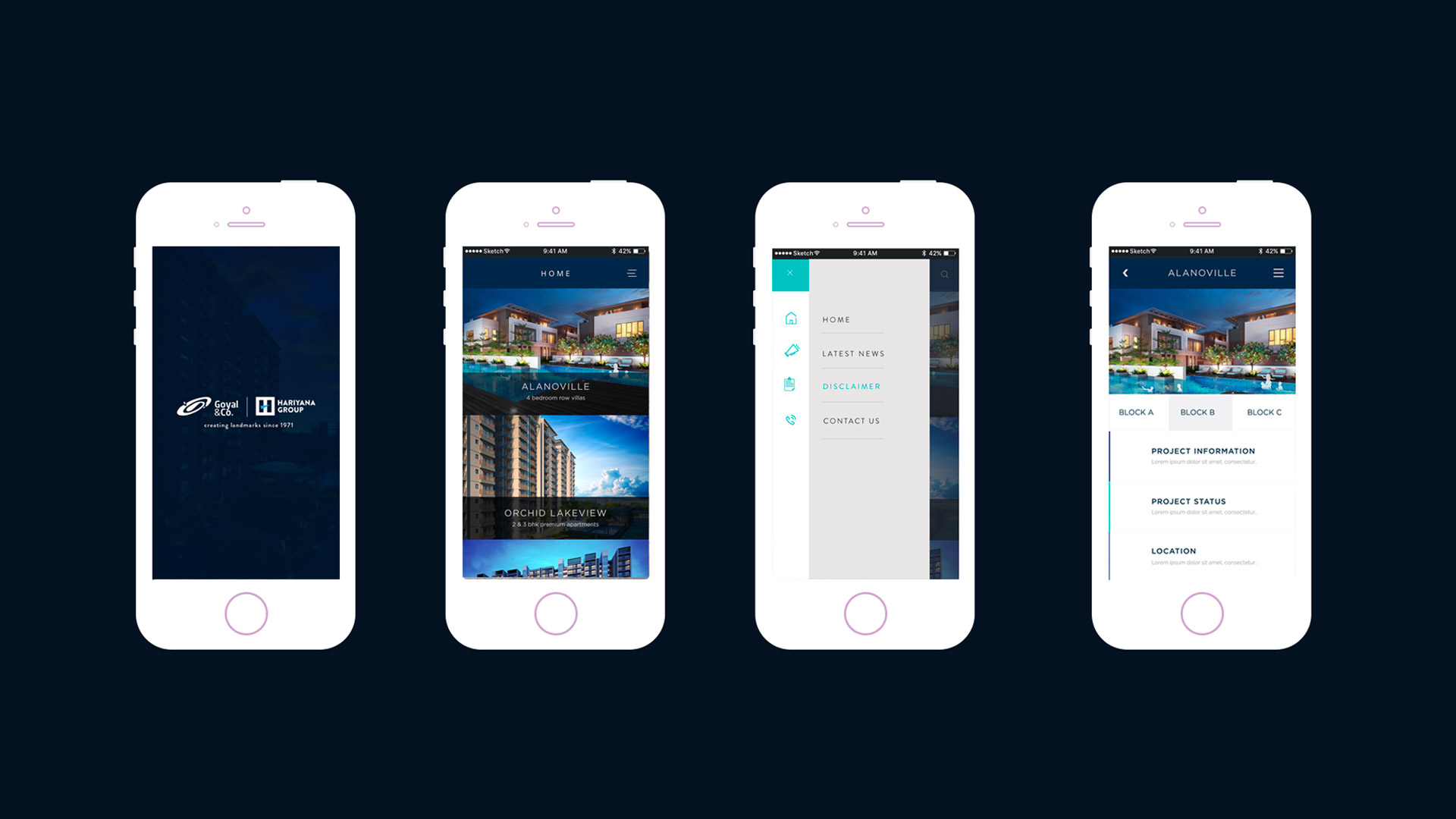
App designed & developed
1
Website designed & developed

SOLUTION.
Design
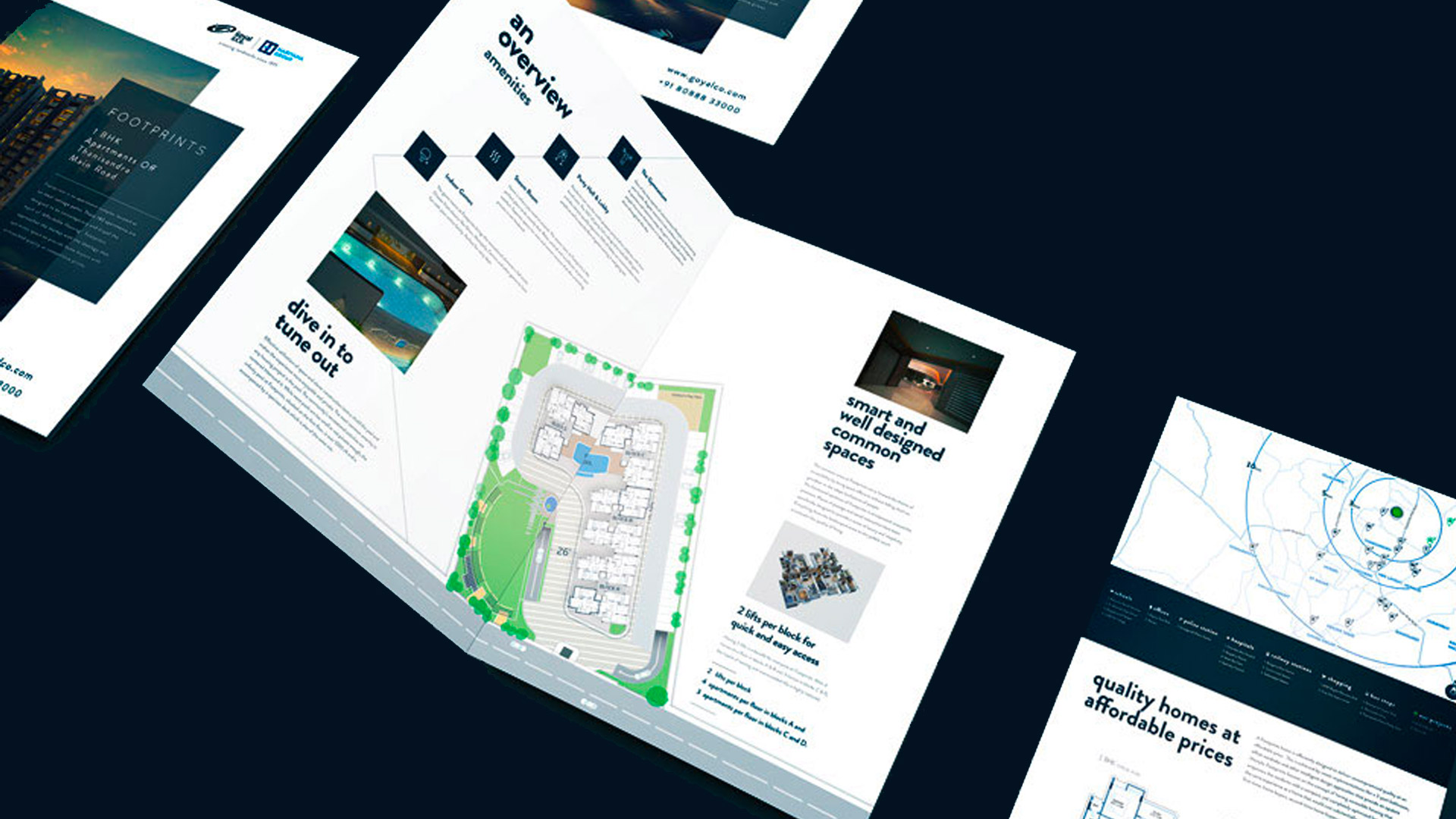
Luxury in simplicity was the way to go for us. While we had to adapt all communication to the 'premium' tag, we also had to keep in mind that the company's real estate projects spanned one bedroom apartments and also four bedroom villas, and the brand language had to cover the entire spectrum. We chose bold colours, textures, and simplistic illustrations and iconography - something that has always been a constant with the brand. Shades of gold, silver and bronze, and textures related to the housing business was at the core of the design approach.
Content
No matter how premium the look and feel might be, if it isn't put in words, literally, it doesn't come together. All copy needed a completely new approach, right from the way we addressed team members, to how we labelled the properties and restructuring calls to action. It was rebranding down to the smallest detail, to ensure that every stitch stays in place for the larger picture to come across with conviction.


Website Branding Concept
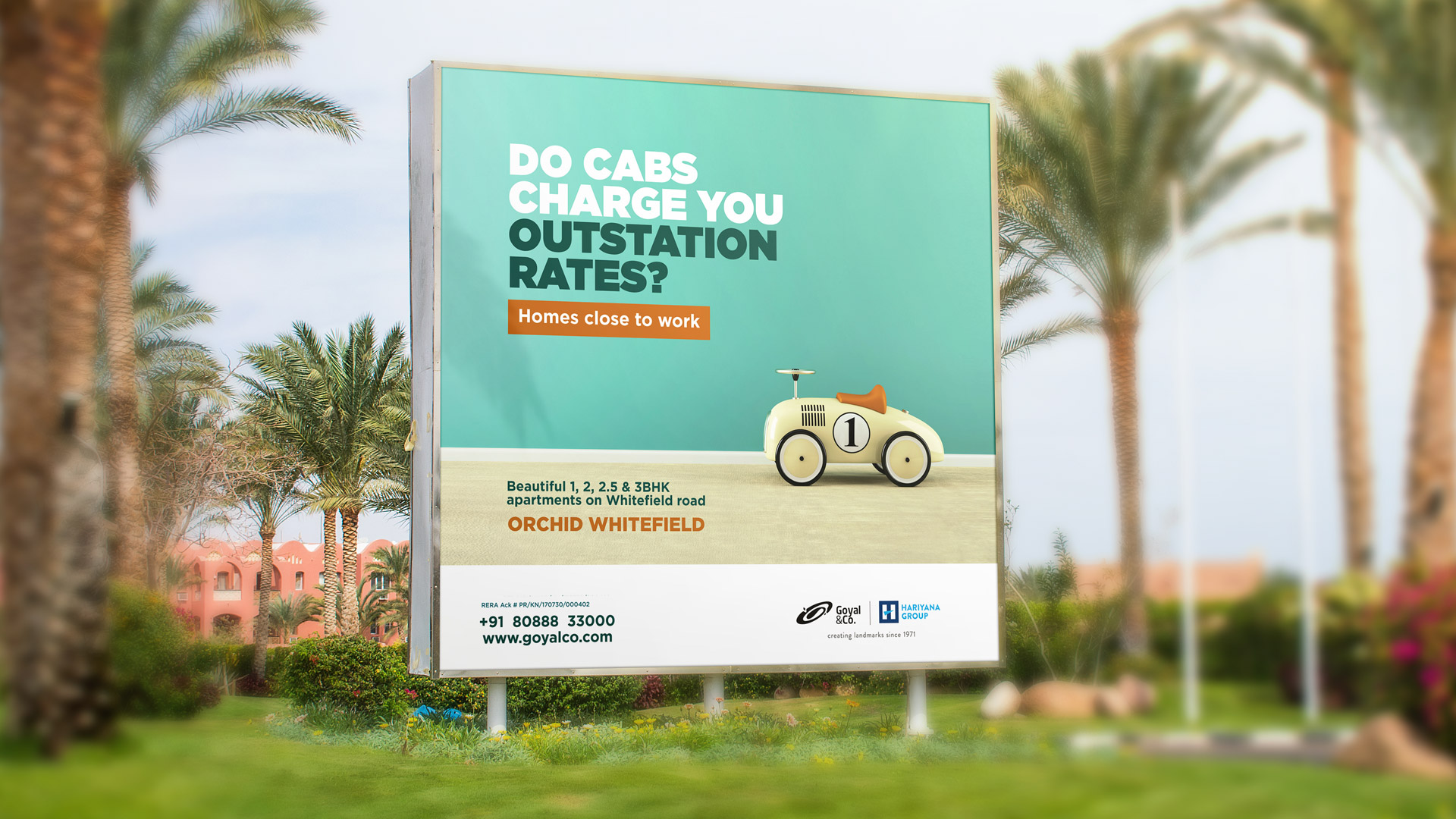
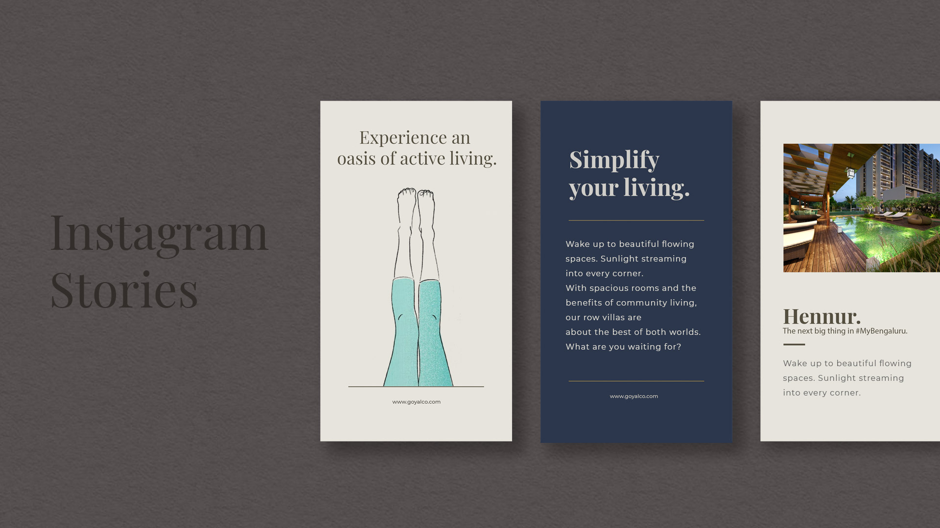
Outdoor Campaigns